Case Study: Thick - A Plus-Size Fashion Brand
Client Overview
Thick is a plus-size fashion brand with a flagship brick-and-mortar store located in the heart of the Los Angeles Fashion District. Catering primarily to middle-aged women, the store also attracts a diverse clientele, including younger and older customers as well as a strong LGBTQ+ community. In a competitive retail landscape, Thick needed a brand identity that would stand out, remain timeless, and adapt seamlessly across multiple applications, from store signage to product labels.
Branding Challenge
Thick sought a new brand with a logo that would:
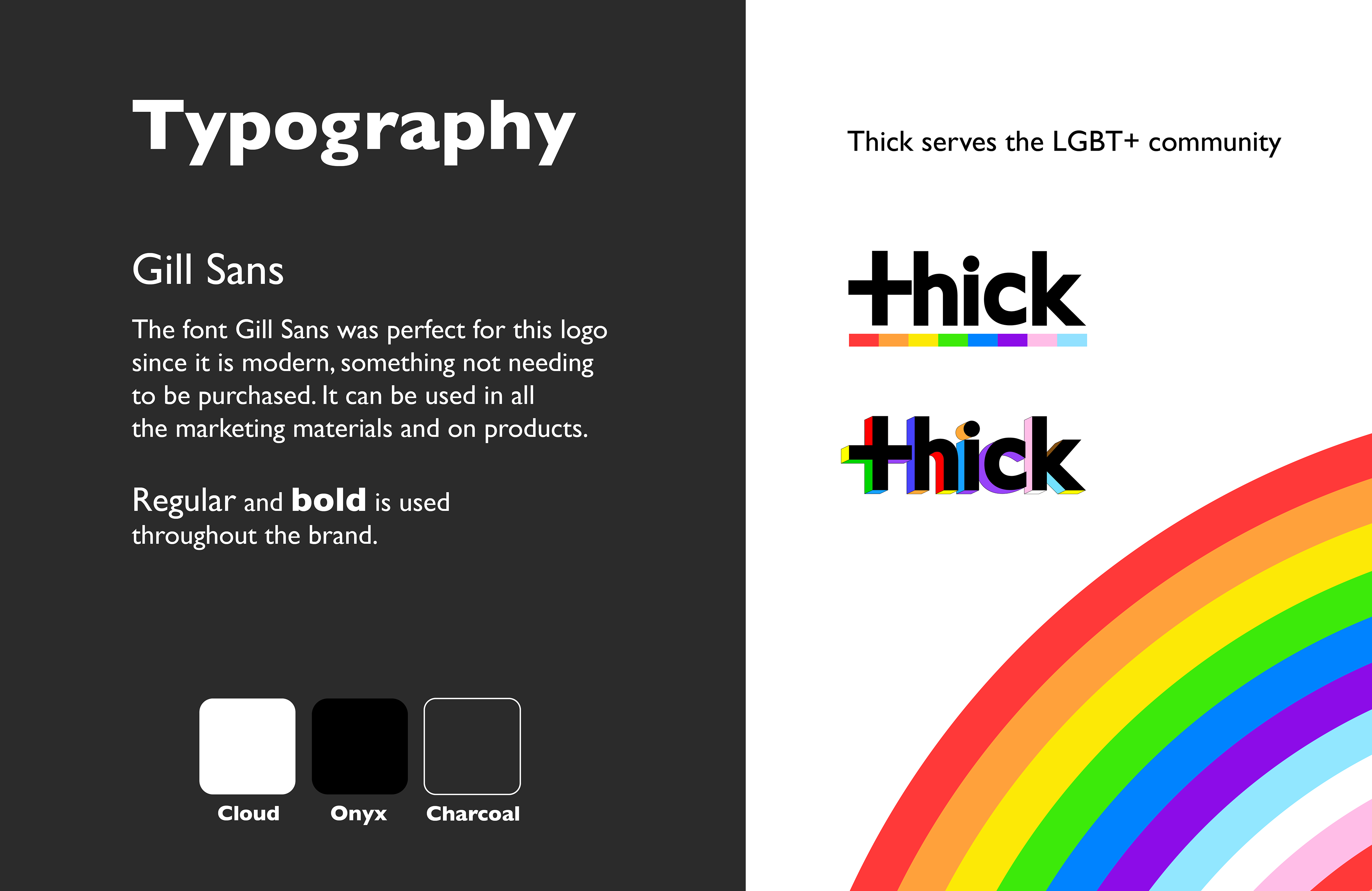
Put them on the map as a customer-first, LGBTQ+ friendly and body positive brand
Make a bold visual statement amidst the crowded fashion district.
Exude a timeless and classy aesthetic.
Be versatile enough to function as a small apparel label and a prominent storefront sign.
Resonate with its core customers, fostering a sense of identity and belonging.
The branding and logo needed to be very cost effective and easily be placed on products and digital & print materials.
Brand Strategy & Execution
To create a brand identity that deeply connected with Thick’s audience, I conducted extensive research, focusing on cultural and linguistic elements that celebrate plus-size fashion. This led to the development of impactful brand phrases like "Thick is the new thin" and the discovery of the term "thick" in slang dictionaries, reinforcing a positive, fun, empowering message.
One of the standout branding elements was the dressing room signage, which became a highly engaging customer touchpoint. The sign was so well received that it became an organic marketing tool, as customers took selfies next to it and shared them on social media, increasing brand visibility.
Results & Impact
The storefront sign quickly gained attention, drawing more foot traffic into the store. Customers resonated with the branding, as reflected in spontaneous reactions like one shopper exclaiming, "I saw the sign and THAT'S ME!" This emotional connection translated into increased customer engagement and in-store visits.

Community Engagement & Inclusivity
Recognizing the strong presence of LGBTQ+ customers, Thick expanded its branding efforts to foster an inclusive and safe shopping environment:
During the pandemic and periods of political unrest, I designed signage featuring the LGBTQ+ version of the logo with the message: "You are safe here."Every year during Pride Month, Thick celebrates by introducing a special rainbow-accented LGBTQ+ logo, reinforcing the brand’s commitment to inclusivity and allyship.
Conclusion
By combining thoughtful research, cultural awareness, and bold design choices, Thick successfully transformed its branding into a statement of empowerment, inclusivity, and identity. The impact extended beyond aesthetics, creating a retail experience where customers felt seen, valued, and celebrated.

Exploring the Future of Thick: Expanding into a Personal Shopper App
